There are many libraries in python available for making charts from the data. By which you can create charts and derive underlying information from the data. Plotly and Matplotlib are two of the libraries for it. Let’s see the comparison between Plotly vs Matplotlib and see which is best for performing the best data visualization in python.
What is Matplotlib in Python?

Matplotlib is the library for plotting static visualizations in Python. With Matplotlib, you can create almost all types of graphs like bar graphs, scatter plots, box plots, etc.
Read this if you want to learn about all types of graphs.
Seaborn is also another library for making charts built on top of Matplotlib. Which provides easiness for plotting charts.
Matplotlib Python example
Well if you are learning data science then you probably using Matplotlib for Exploratory Data Analysis tasks(EDA). But haven’t yet, don’t worry let’s see one example of the Matplolib.
import numpy as np
import matplotlib.pyplot as plt
import plotly.express as px

#generating data
np.random.seed(50)
x_data=np.random.random(50)
y_data=np.random.random(50)

#creating scatter plot
fig,ax=plt.subplots()
ax.scatter(x_data,y_data)
fig.show()
Here we have created one simple scatter plot with 50 random values. As the result, the graph will look like this:

Now if you want to change the color of the dots, or add titles of the x-axis, y-axis, or graph then you have to use different functions for them that Matplotlib provides.
Let’s check this also by adding these to the above graph.
fig,ax=plt.subplots()
ax.scatter(x_data,y_data,c='red')
plt.title("Some Random Data")
plt.xlabel("X-Axis")
plt.ylabel("Y-Axis")
fig.show()

Matplotlib provides many customization options that could give you your expected result.
Also Read: Naive Bayes Classifier in machine learning- All you need to know
What is Plotly?

Plotly is another library that supports many unique chart types for a wide range of use cases.
Unlike Matplotlib, Plotly supports not only compatible with python but also R, Julia, Javascript, and MATLAB.
In Plotly all charts are interactive. With Plotly, you can make 3d graphs too very easily.
For each chart, Plotly also provides utilities to download charts, zoom in or out, etc without writing any other code.
Plotly Python Example
We will take plot the charts for the exact values which we had taken for Matplotlib for example. You have to download Plotly with pip install ploty.
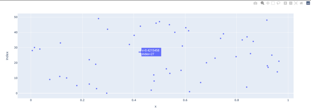
import pandas as pd
import numpy as np
import plotly.express as px

np.random.seed(50)
x_data=np.random.random(50)
y_data=np.random.random(50)

plotly=px.scatter(x_data,y_data)

plotly.show()
We are using plotly.express from Ploty to make charts. And the result is as follows:
This looks nice. Let’s take another example by generating a bar graph on the wine dataset.
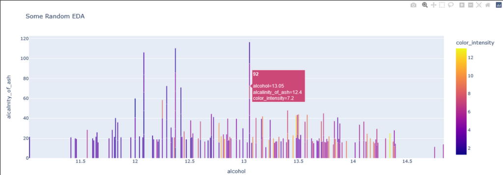
import pandas as pd
import numpy as np
import plotly.express as px
from sklearn import datasets

wine_data=pd.DataFrame(datasets.load_wine().data)
wine_data.columns = datasets.load_wine().feature_names

fig=px.bar(wine_data,x='alcohol',y='alcalinity_of_ash',color='color_intensity',hover_name='magnesium',title='Some Random EDA')
fig.show()
Now here we added some extra parameters. color will plot the bar color as per the color_internsity column. The hover_name will show the value of magnesium when you hover over the bar. And the title parameter is the title of the graph.
There are many other parameters by which you can customize the chart and could make them more attractive.
There is also a Graph Objects function like express by which you can create subplots or can add more columns in one graph.
Plotly vs Matplotlib: Which One to choose?
You have seen basic examples of both Ploty and Matplotlib. You might be wondering which one should I use.
Matplotlib provides more customization than Plotly. Though some of the customizations require complex ways to solve, it provides great results.
Therefore Matplotlib is used for professional use cases. For Writing scientific papers, Matplotlib is used.
Now on the other hand Plotly is more interactive. You can customize the Plotly chart with parameters easily. Therefore Ploty is suitable for websites where you want to show interactive charts in the browser itself.
Also Read: Gradio: Easy Guide for making ML web app for beginners